Steele and Tomczak, 2001. For the Leona Drive Project.
For the “Leona Drive Project” we thought about the site itself – a humble tract containing 5 typical north Toronto (Willowdale) bungalows built between 1948 and 1950 – all about to be demolished. We considered how to make a work that would speak of this demise, this disappearance in some elegiac way – but not with sentimentality. We wanted to make something that would use the vernacular voice of the houses themselves, use their speech, use their own rather chaste syntax of small rooms and cramped 2nd floor bedrooms carved out of crawl spaces and dormers.
We decided upon a sign. A big sign. After all, the era that gave birth to these bungalows also saw the burgeoning of the advertising industry, and with this came the urge to project – largely, if possible – one’s identity, one’s product, one’s place, all in the robust, swaggering form of the sign.
We would make a work – in the form of a sign – that spoke of this imminent demise, demarcating this about-to-vanish set of structures, small houses that would be no more.
We discussed many possible words and terms that we could use to call attention to the impending death of this former community, now boarded up, no longer inhabited, all stale air and teen-aged squatters and tall, tall grass at the back.
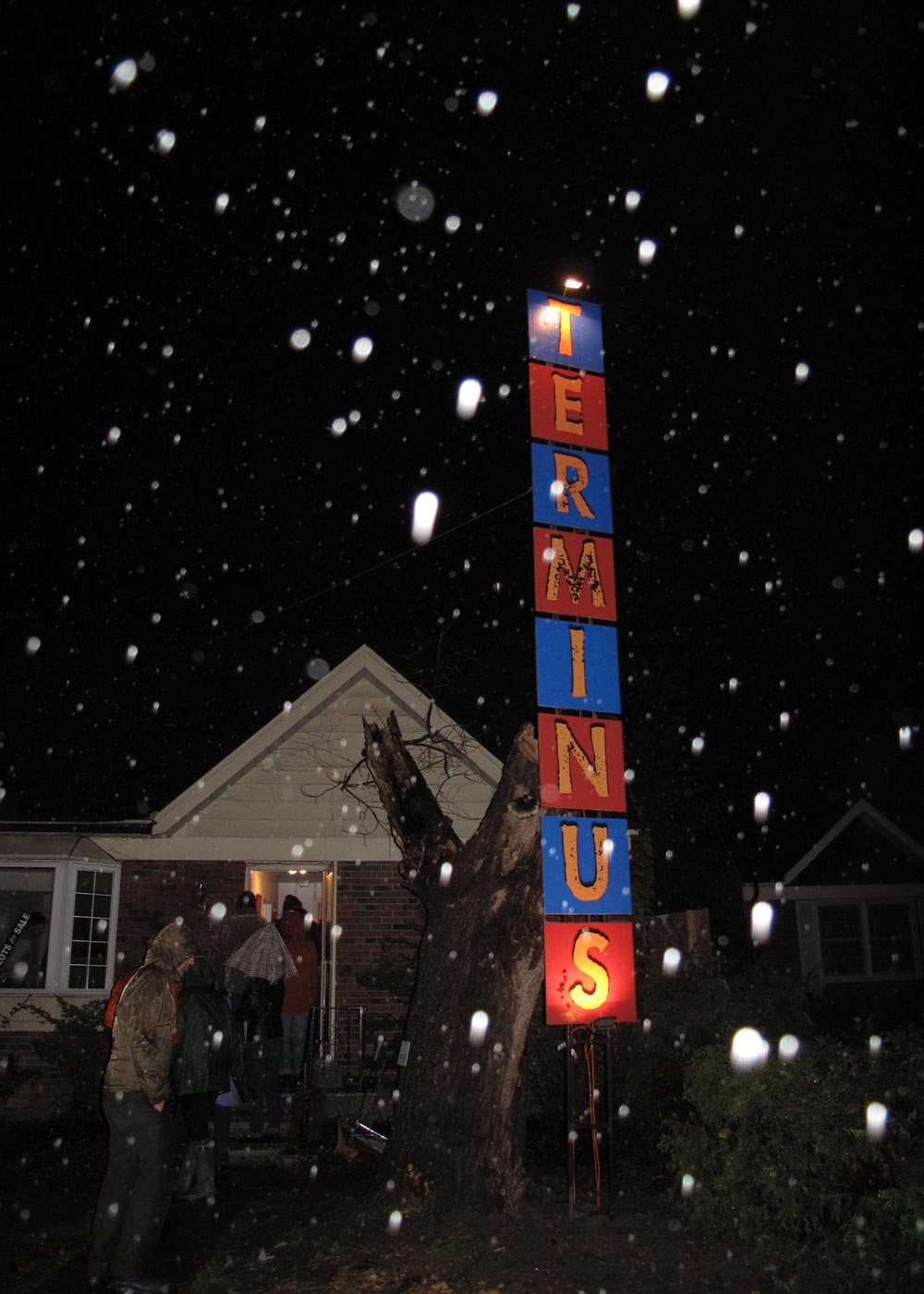
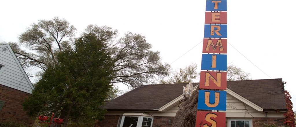
TERMINUS is the word we decided upon. It is a word that denotes both an end and a beginning. In the idiom of long- and short-haul bus travel, the terminus is the place where the timetable originates, the place where the beginning and the end of each route is parsed into its straight stretches, its turns, and its stops. It is measurement itself. How you get from here to there. In short, this Willowdale neighbourhood. This place that stands in for all of Toronto in its post-WWII building boom that saw row upon row, block upon block, mile upon mile of bungalow construction to accommodate the boom that became the sprawl that became the city that is now, early in the 21st century, seeking urban density in the name of progress.
Taking the form of the historically resonant single-letter vertical sign, TERMINUS stands in as both a brash announcement for the future – a la a Las Vegas motel circa the original Oceans Eleven – and a hapless nod to the it’s-over-now past – echoing the broken down bus terminals of the American mid-west and the no-star hotels of Paris.
Affixed to an existing TV antenna salvaged from the site, the individual letters are referenced in the typeface of a 1950s film noir poster, one that has slightly gone to seed, with frayed edges and imperfections giving off an air of slightly sinister decay. But this is counterbalanced by the colours we use. With background colour and letter colour alternating between royal blue and tangerine, our sign assumes a gaudy, festive air of announcement similar to those mid-20th century mainstays trumpeting highway roadside attractions (“see the Giant Squirrel” or “Reptile World”), tempting generations of children with dreams of wonder. For historical purposes, we cloned both colours from Boogie Doodle, a film produced by Canadian animator Norman McLaren in the 1940s, a film likely seen by children who moved into these bungalows when they were first built. Here again we are tempering the sense of mournful loss to one of tempting possibility. As its definition indicates, TERMINUS serves to mark the end of one neighbourhood (the demolition of the post-war bungalows) and the beginning of another (the soon-to-be-constructed residences that will replace them).